Visual identity for a Vienna festival of contemporary music theatre
Year2025/ongoing
- Role Creative Direction, Design, Editorial System
- Services Campaign, Visual System
Creative DirectionVincent Grabowski
ScopeVisual system, key visual, poster series, programme, on-site material, social and web assets.
Context
MUSIKTHEATERTAGE WIEN is an annual festival for contemporary music theatre, staged each September across changing venues in Vienna — nine productions in the 2025 edition, six of them world premieres. When I took over the visual identity for that edition, there was little to build on: a loosely defined colour and a typeface, both open to replacement. Nothing that held the festival together as a recognisable entity.
Challenge
The programme is defined late. Individual productions are often still in flux well into summer, while communication has to start months before. A season's identity therefore cannot be built on its content — the work does not exist yet when the first posters go out. That is not only a conceptual problem but a production one. Spring publications were being built from texts that had to be extracted from artists whose pieces were unfinished, then edited and forced through a print deadline that would not move. The third constraint is spatial. The festival moves through venues it does not own, from a theatre to a former factory, and the set changes from year to year. Whatever the identity is, it has to hold on surfaces nobody controls.
Approach
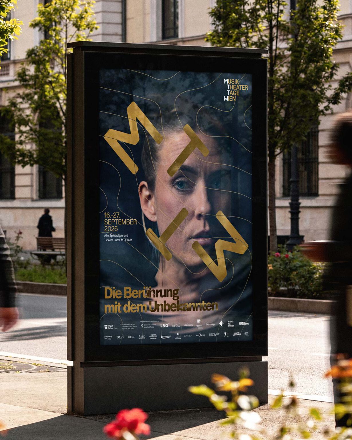
Rather than tying the identity to individual productions, the system is built around a recurring touring pattern: a graphic motif that moves across poster, programme and space. It stands in for what connects the festival's works before their content is known — the movement and resonance of air, sound and body. Because the pattern can be laid over any image or surface, a season can be launched that has not been written yet. The second answer is editorial rather than graphic. A season is published in two folders. For 2026 the first one stopped pretending it could describe work that does not exist: it outlines the themes, names who is involved and explains what the festival is, and goes no further. The depth moved entirely to the second folder, published once the programme was fixed. One publication now does what two were previously asked to do badly.
Visual System
The pattern is the constant, everything else is variable. It sits over photography, over colour, over type, and keeps its character from a social post to a building-sized surface. Typography carries the second half. The inherited typeface was open to replacement, and replacing it was the second decision the system rests on — it has to hold the density of a programme and the distance of a poster at the same time. For 2026 the pattern returns reduced: fewer layers, more space. The second year reads as a continuation rather than a repetition.
Applications
Print, digital and spatial. On one side the poster series, programme book, piece flyers, advertisements and social assets. On the other, material that has to work in the city and inside venues the festival does not own: guidance system and banners, a construction-fence tarpaulin, venue flags, a logo wall, table covers at 620 by 110 centimetres, lanyards, wristbands and merchandise. Production runs directly with the festival's printers, including a risograph card series.
Outcome
The system carried the 2025 edition. The 2026 edition is designed and delivered, and opens in September 2026 with the pattern refined and more reduced — the second year is a continuation, not a restart. The editorial change showed its effect before anything was printed. Because the spring folder no longer depends on texts from artists whose pieces are still in progress, the annual scramble of chasing, editing and squeezing them into a fixed print deadline disappeared. The production ran markedly calmer than the year before.
Reflection
The strength of the system is that it does not depend on knowing what the festival is about yet — it gives MTTW a signature that can exist independently of any single season's theme. The open question is the key visual, which still rests on a photographic portrait. This is ultimately a festival decision rather than a design position, and challenging that choice before a season starts would have meant overlooking the potential of the system as a whole. Instead, the focus was on applying the graphic language consistently across every touchpoint of the 2026 edition, allowing recognition to build through the pattern and typography rather than relying primarily on a face. If that approach proves successful, the 2027 edition could give the graphic system an even more central role, with less reliance on a photographic motif. That is the direction I am working toward.