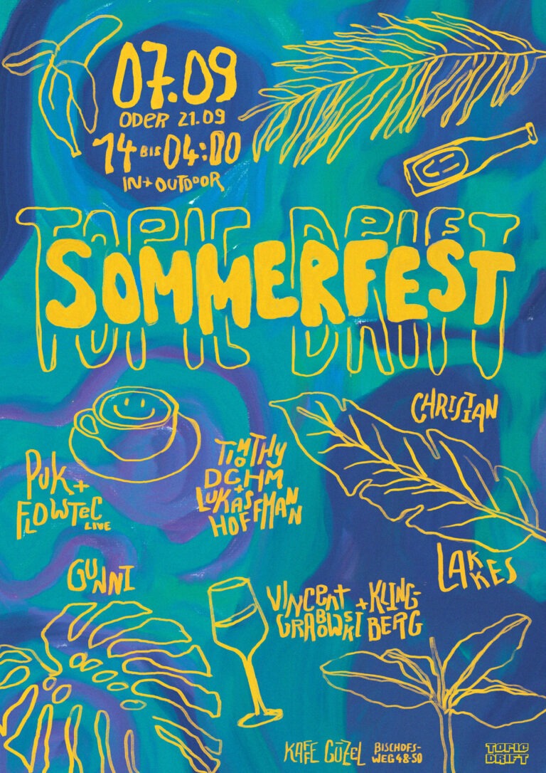
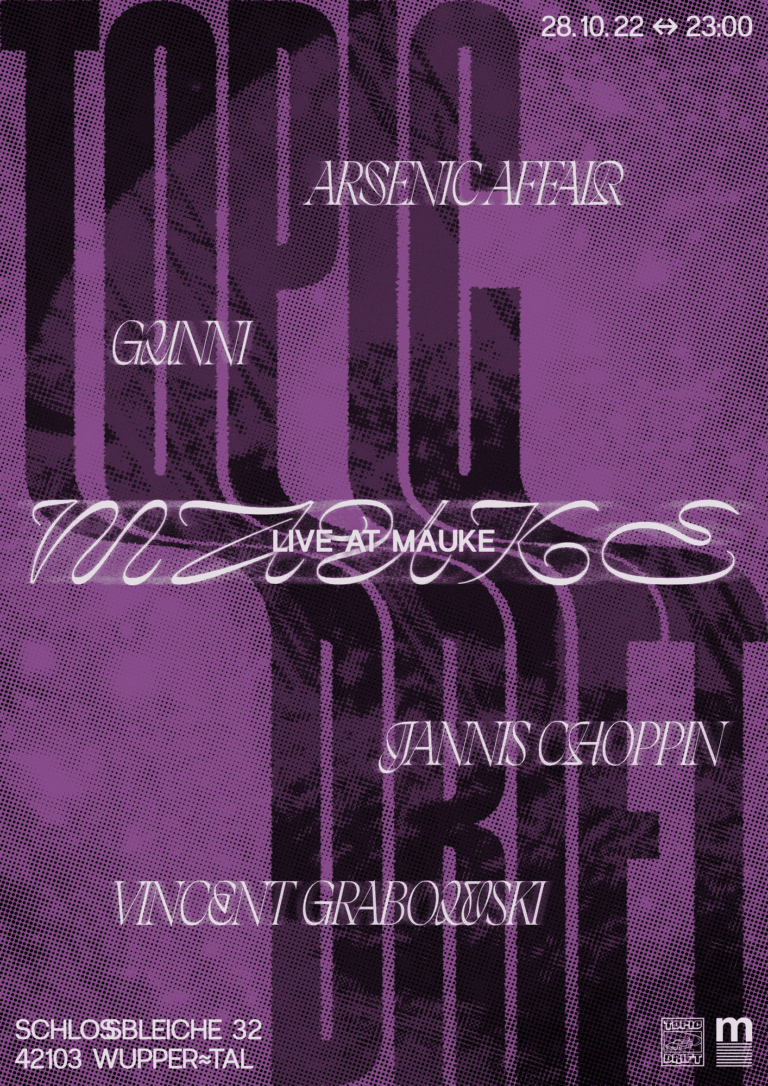
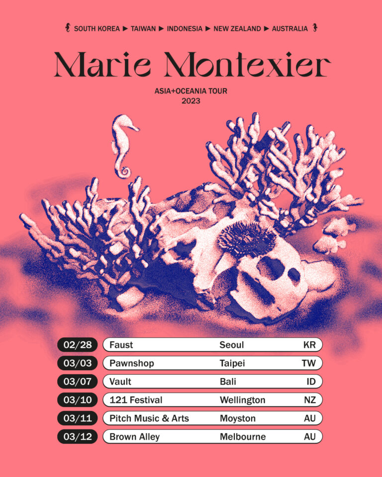
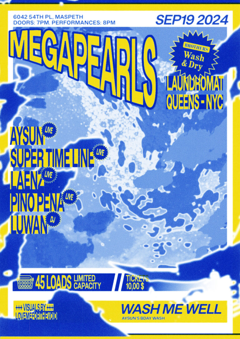
Elektra Visual Concept
Visual identity and event system for a recurring party series — turning changing motifs into a recognizable, high-energy language across posters, motion and social media.
Year2024/ongoing
- Role Creative Direction
- Services Brand Identity, Motion, Poster, Social Media, Visual System
Creative DirectionVincent Grabowski
ScopeVisual identity, poster system, motion templates, social media assets, artist presentations
Context
Elektra is a recurring party series with a strong scene-facing character and an active community around its events. While the format has a partly commercial energy, it is still rooted in a more specific club audience — social media followers, regular guests and fans of the booked DJs.
Before the new visual direction, Elektra had worked with different designers and visual approaches. The results varied from event to event, but the overall communication lacked a consistent identity. My role was to develop a clearer visual line and create a system that could support future events without starting from scratch every time.
Challenge
The main challenge was to create recognition without turning the communication into a rigid template. Elektra needed a system that could work for events every two months, handle changing line-ups, different venues, varying amounts of information and different visual starting points.
The previous process required a lot of repeated individual work. Each event had to be discussed and designed almost from the ground up, which made decisions slower and visual consistency harder to maintain. The new system had to reduce these frictions while still allowing each event to have its own character.
Approach
The visual identity was developed through a process of strategic and visual exploration. In several meetings, I asked questions about the identity of the collective, its audience and the atmosphere Elektra wanted to create. This helped initiate and structure internal discussions and made it easier to define what the series should visually stand for.
The resulting direction is bold, eclectic, fast, dynamic, techy and loud. At the center of the system is a recurring distortion principle: a changing motif is transformed through the same visual treatment, creating a consistent look across different source materials. The distortion is inspired by electromagnetic waves and becomes the main visual device of the identity.
Visual System
Elektra’s system is built around the transformation of a motif rather than around one fixed image style. The source material can vary — from details of a location, such as an iconic sound system, to graphic interpretations of light installations or abstract compositions connected to a specific event.
By applying the same distortion logic, these different motifs are pulled into one recognizable visual language. This makes it possible to work with material of varying quality while still creating a coherent appearance.
Typography adds a second layer of flexibility. A variable grotesk allows the hierarchy to shift depending on the event: some posters need to feature many DJs, others only a few; venue names can be short or long; microtypographic details can support the louder key facts and visual eyecatchers. The system is completed by small symbols and typographic details inspired by electrical circuits.
Applications
The system was applied across static and animated event communication, including posters, social media flyers, artist presentations and motion assets.
The animation templates became an important part of the system. They extend the wave-like distortion into motion and help transfer the visual identity from print-like layouts into digital communication. This made the identity more dynamic while also saving time and production costs for future events.
Outcome
The new framework gave Elektra a stronger and more recognizable visual presence. Decisions became easier to make, direction discussions were reduced and the design phase became more efficient. Instead of reinventing the look for every event, the system now provides a clear structure that can be adapted quickly.
The client responded positively to the result and felt represented by the new direction. The identity creates recognition while still leaving enough space for event-specific motifs, changing line-ups and different formats.
Reflection
Elektra shows how a strong visual identity can come from a repeatable transformation rather than from a fixed template. The most interesting part of the project was finding a system that could handle different motifs, formats and amounts of information while still feeling bold and coherent.
The distortion principle became the connective element across static and animated media. It gives the series a distinct visual rhythm and allows the identity to stay recognizable even when the underlying imagery changes. The main limitation lies in the choice of source material: not every event naturally provides an obvious motif. But the framework is strong enough to also work with more abstract graphics, gradients or visual interpretations, as long as the distortion remains the central device.