Paryìa

Visual direction for a music label and event series, translating vinyl releases, posters and abstract photography into a calm but recognizable visual language.

Year2024/ongoing

Creative DirectionVincent Grabowski

ScopeVinyl artwork, release visuals, event posters, promotion assets and visual system development.

Context

Paryìa is a music label, platform and party series rooted mainly in house, techno and more experimental forms of club music. Its character is fluid and organic — moving between contemporary electronic sound, vinyl culture and the raw, authentic energy of 90s club music.

Before I took over the release designs, the label had worked with different designers. The individual results were often ambitious, but the overall appearance lacked a clear visual line. Across the last three releases, my role was to bring more calm, consistency and recognition into Paryìa’s visual world without making it feel fixed or overly branded.
Challenge

The main challenge was to translate an abstract musical range into a visual language that could hold together very different formats: full-cover releases, EPs, labels, posters and event communication.

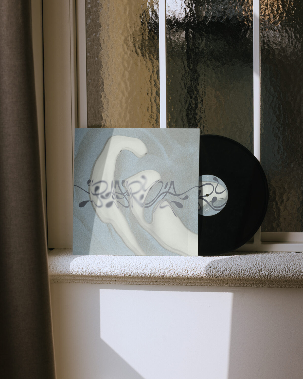
For the full-cover releases, each artwork still needed its own atmosphere. For the EP releases, the question was more practical: how to reduce production costs without making the design feel generic? I developed a standard cover principle that allows Paryìa to produce a higher quantity of base covers across multiple releases. The individual design effort shifts to the label area, turning an economical decision into a recognizable design feature.

Approach

The visual language is built around abstract photography from nature, surfaces and materials. These images give the releases depth and atmosphere without becoming illustrative. Typography stays reduced and quiet, while the palette remains earthy and muted, contrasted by moments of intense orange.

Instead of building a strict identity system, the work defines visual guidelines: material, rhythm, restraint, color and atmosphere. Many more experimental directions were explored during the process, but often reduced again to uncover the calmer core of the label.

Visual System

Paryìa now works with two release logics: The full-cover releases allow more individual expression while staying within the broader visual attitude of the label. The EP releases follow a more systematic principle: a reduced standard cover creates recognition, while the label carries the specific identity of each release.

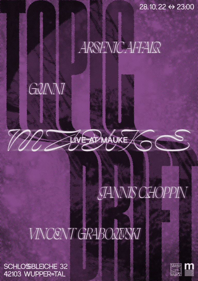
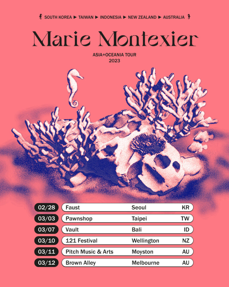
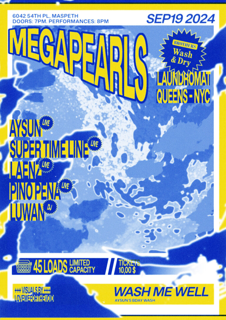
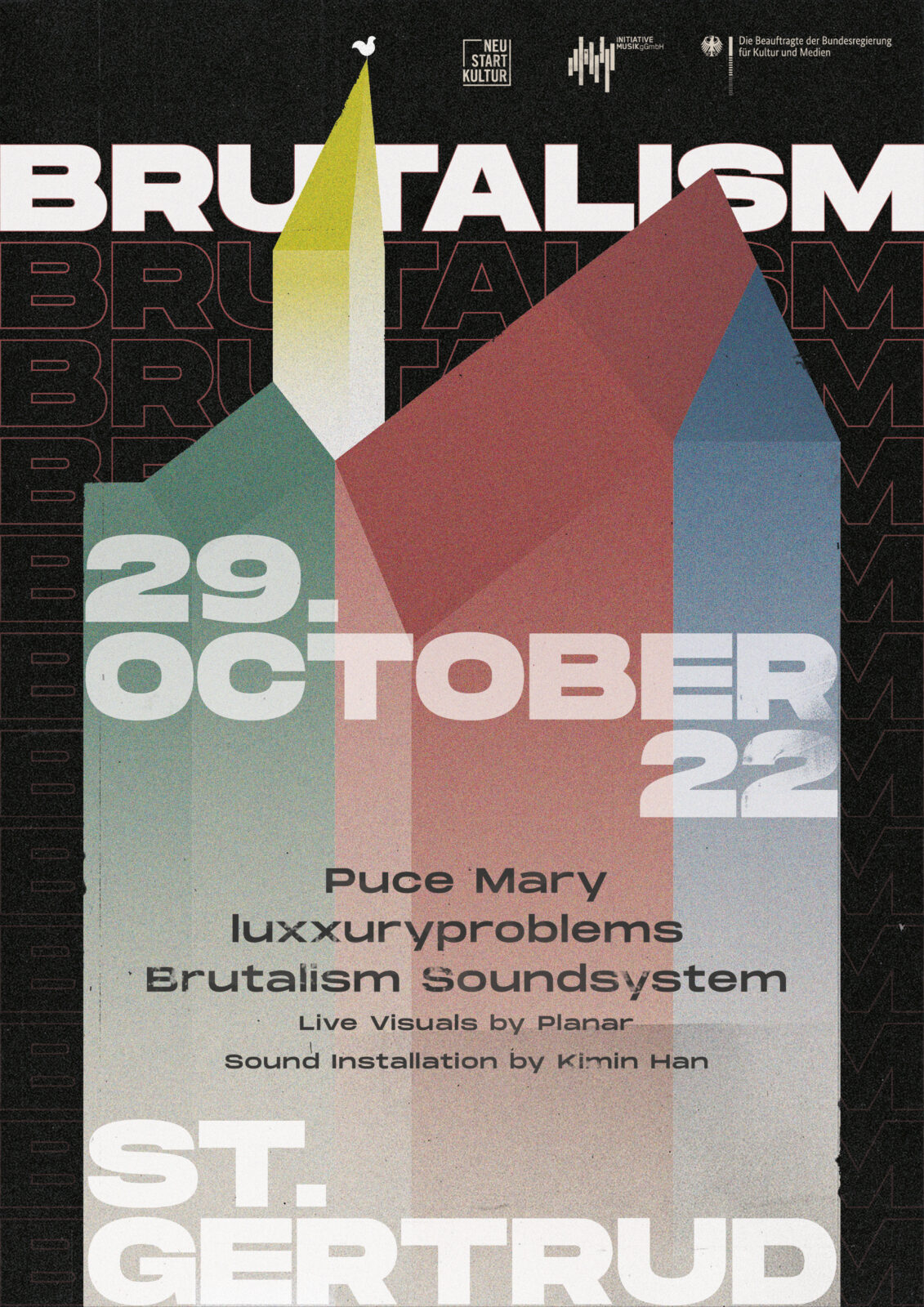
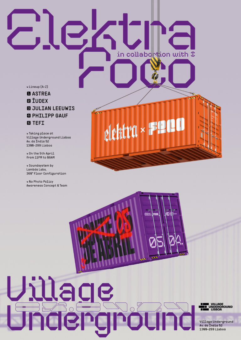
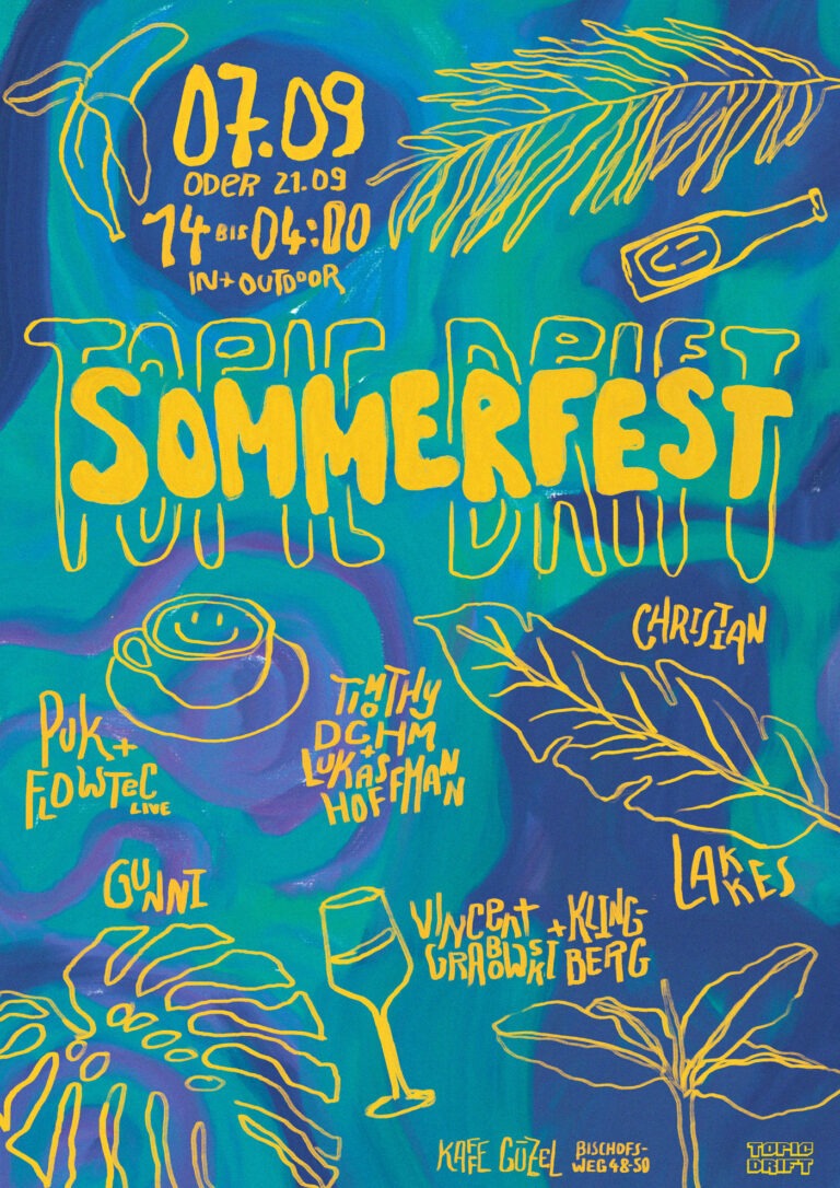
The posters add a third layer. Some extend the release aesthetic directly into event communication. Others are treated as standalone happenings with their own identity. This flexibility is important to Paryìa: not everything has to be forced into the same system, but the system gives enough clarity to know when an exception makes sense.

Applications

The central applications are the full-cover release designs, the EP standard cover system, EP labels and selected label event posters.

Outcome

The work helped Paryìa move from a collection of strong but unrelated visual styles toward a calmer and more recognizable visual direction. The label now has clearer visual guidelines, while still leaving enough room for future development. The EP system also introduced a production advantage: by using a standard cover across multiple releases, one-off costs can be reduced, while the labels become the place for individual variation.

Reflection

Paryìa brings together many things I enjoy working with: music, vinyl, poster design, print production and experimental photography. A large part of the process was about bringing calm into a broad musical world — not by limiting it, but by defining the right visual boundaries.

Through the dialogue with the label founder, a clearer image of Paryìa emerged over time: reduced, organic and recognizable, but still open enough to evolve.

related works

DSGVO Cookie Consent mit Real Cookie Banner